(
a–c) Ongoing activity statistics computed in absence of pulse packet stimulation (gray region in Figure 1b) from a simulation of

. Color code as in Figure 1. Filled/empty inverted triangles: mean/s.d.. (
a) Mean rate distribution of individual neurons. (
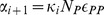
b) Distribution of

values. (
c) Distribution of pairwise correlation coefficients (inset: auto-covariance function of the population spike train). (
d) Pulse packet amplitude transfer map. Black trace: membrane potential distribution of

neurons in its c.d.f. form plotted as a function of the distance to spike threshold (

; “Jump”). Gray lines: average voltage depolarization (“Jump”) caused by a pulse packet of
. Dark gray line: depolarization when

which is the value used in this work. Light gray line: depolarization when

. Red dots and dotted lines: trajectory of a pulse starting from a fully activated layer (

). (
e) Effect of stimulation with a single pulse packet (

;

). Subpanels: time evolution of inhibitory and excitatory conductances (

and

) averaged across

neurons (upper); and evolution of the membrane potential distribution for

and

neurons (lower). Gray region: optimal time window for the arrival of a hypothetical second pulse packet. Cyan dot: arrival time of the actual pulse packet. Magenta/green dot: hypothetical arrival of a second pulse outside/inside of the optimal time window. Dotted lines: mean

s.d. across neurons. Black dashed line: Same as blue trace in Figure 4b bottom (

), resonance curve plotted as a function of time interval instead of frequency.